
JANSSON, Jan (1588-1664); and [Dirck Jansz. VAN SANTEN (1637/8-1708), colourist]
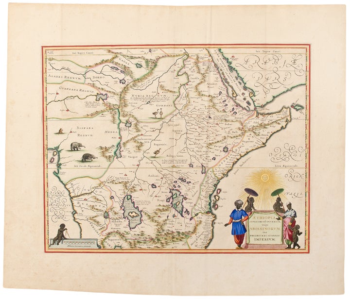
Aethiopia Superior vel Interior vulgo Abissinorum sive Presbiteri Ioannis Imperium
Amsterdam: after 1640. Copper engraved double page map, beautifully hand coloured by Dirck Jansz. Van Santen at the time of publication, sheet size: 21 x 24 1/2 inches. Without text on verso.
A masterpiece of hand colouring by a Dutch old master.
A beautiful map of central and Eastern Africa, including Mozambique north to present day Sudan. The map contains numerous coastal place names such as Mozambique Island, Quiloa, Mombaza, and Melinde indicating the importance of the area to both Arab, Portuguese, and traders and explorers from other countries. The map includes numerous rivers, villages and settlements throughout, and is highly embellished with elephants, ostriches and other animals within the map, as well as a decorative cartouche flanked by natives. The two Ptolemaic lakes of Zaire and Zaflan are in the lower portion of the map; Lake Niger, and the supposed course of the Niger River, is shown flowing westward. This map is based on Ortelius' 1573 map of the fictitious kingdom of Prester John. The myth of Prester John, the good Christian King of Africa waging his own crusade and defeating the enemies of Christianity, was based upon earlier legends of the Crusaders and is a fascinating piece of early mythological cartographic history. The present example is superbly hand coloured by famed illuminator Van Santen, with copious use of gold highlights identifying each town, boundaries, the gradients, the Equator and Tropic of Cancer, the sun burst above the cartouche and other highlights. "Atlases and books coloured by Van Santen figured among the showpieces of the most prominent collections ... and [books] decorated by Van Santen were considered gifts worthy of princes ... The colours, the gold, the patience and industriousness of Van Santen were obviously of great renown at the end of the 17th century ... His use of colour was much freer than that of other colourists. The tone of the colours was made to complement the gold he used so lavishly. In his best work two other costly pigments, ultramarine and carmine are found in large amounts, mostly set against gold" (Goedings). The present map includes the use of ultramarine, i.e. lapis lazuli, on the clothing of the native flanking the left side of the cartouche. Literally meaning "from over the sea," the pigment was made from the semi-precious stone Lapis Lazuli, found at the time only in Afghanistan. During the Rennaissance and Baroque periods, the striking blue pigment, which was more expensive than gold, was used only by artists of great renown, including Vermeer, Titian, Massaccio, and, as the present map confirms, Van Santen.
Van der Krogt (Atlantes) 8720:1B; Truusje Goedings, "Dirk Jansz. Van Santen ... A Survey" (Amsterdam, 1992).
Item #27603
Price: $7,500.00